Logos are more than just cool designs, they're powerful tools that help shape how we see a brand. While some logos are clean and simple on the surface, many of them carry hidden messages or clever visual tricks that say a lot without using a single word.
Some companies put serious thought into how their logo reflects their mission, values, or even the services they provide. Once you spot these hidden elements, you’ll never unsee them, and it just makes you appreciate good design even more.
So let’s break it down. Here are a few famous logos with hidden meanings that you might’ve missed.
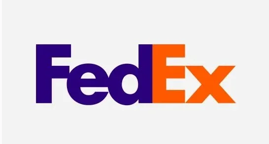
Did you see the arrow?
Look closely between the “E” and the “x.”
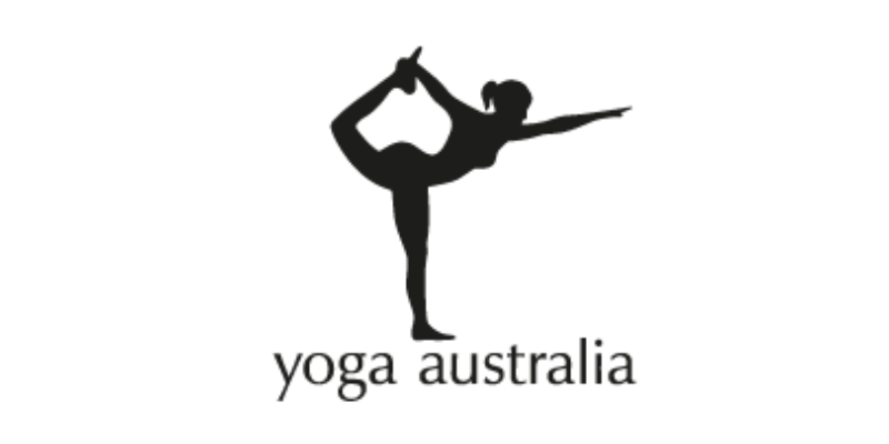
The space between her arms and leg forms the shape of Australia.
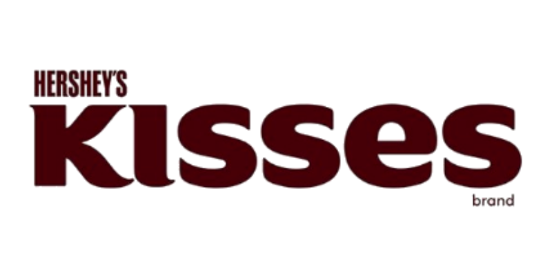
Between the “K” and “I”, there’s a hidden Hershey’s Kiss in the negative space, tilted sideways.
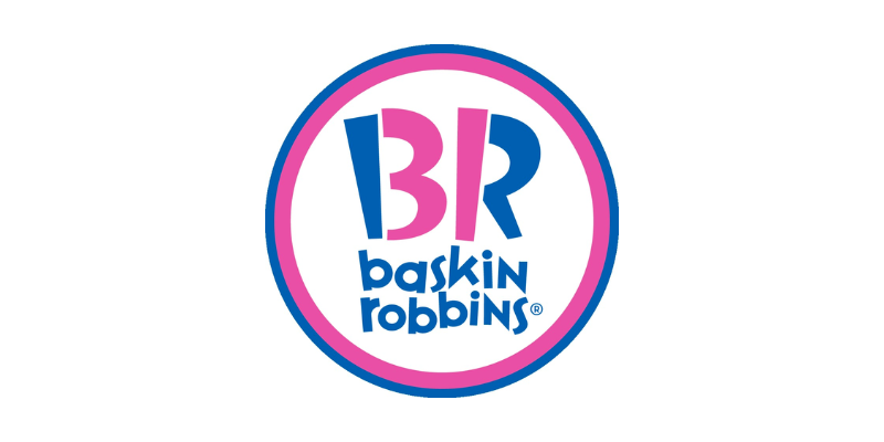
The “B” and “R” also shows 31, which represents the brand’s 31 flavors—one for every day of the month.

On the collar of the girl’s dress, you can read the word ‘mom’.
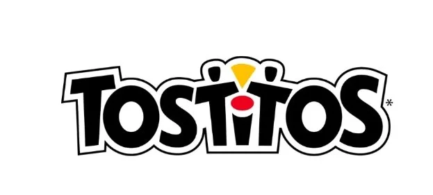
The two lowercase “t’s” are people sharing a chip, dipping it into the dot of the “i”.
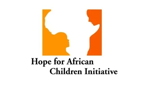
Outside the shape of the African map, is the outline of a child and their mother.
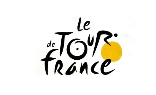
The “R” in “Tour” becomes the body of a cyclist, with a wheel cleverly formed by the yellow circle.
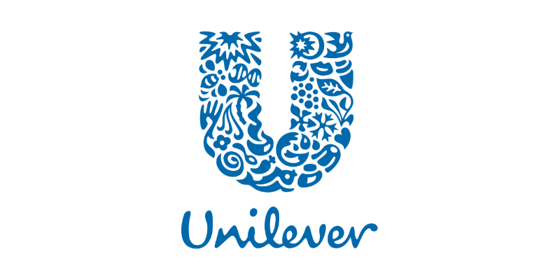
The ‘U’ on the logo is formed by all the types of goods sold by Unilever.
The arrow goes from A to Z. Showing they sell everything

Inside the elephant figure is a giraffe, a rhino, and a reference to Cologne’s cathedral.
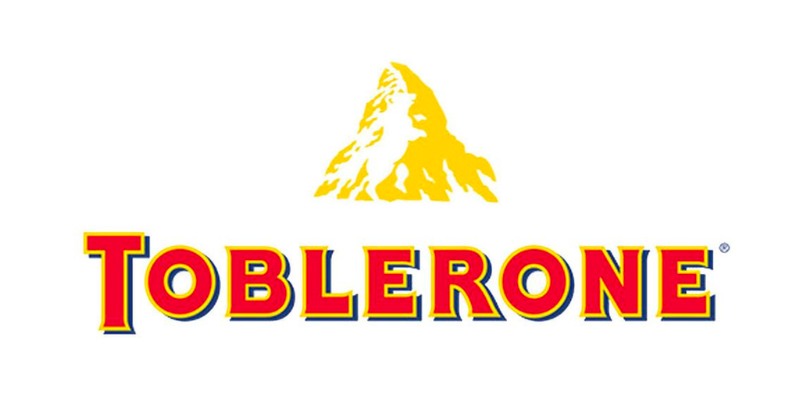
Make it stand out
Inside the mountain is a bear. It represents the city of Bern, where Toblerone originated
Design isn’t always about what you see first—it’s also about what’s hidden beneath the surface. These logos remind us that branding is more than visuals, it’s storytelling in disguise.
Which hidden message surprised you the most?
