

How to choose the right colour for your brand’s visual identity
What is Colour Psychology?
Colour psychology studies how colours affect our emotions, moods, and behaviours.
Why You Need to Understand This
Understanding colour psychology is an important consideration when it comes to building your visual brand identity. The colours you choose for your brand can significantly impact how your target audience perceives your business and its values.
When branding, it's important to understand the emotional and psychological associations that different colours can have. Humans are naturally drawn to colours and can be strongly influenced by them.
6 key tips to choosing your brand colour
1. Know Your Target Audience
Knowing your target audience is crucial when choosing the right colours for your brand or marketing materials. Consider the demographics, interests, and preferences of your target audience and the colours that are appealing to them.
Demographics such as age, gender, location, and culture can influence colour preferences. For example, colours popular among younger audiences may not appeal to older demographics, and certain colours considered lucky or unlucky in one culture may have different connotations in another.
The interests and preferences of your target audience can also affect colour choices. For example, a company targeting a wellness-conscious audience may opt for calming and natural colours like green and blue. A brand targeting a younger, enthusiastic audience may use vibrant, bold colours like red and yellow.When choosing colours for your brand, it's important to consider the emotions and feelings you want to convey to your audience.
2. Consider Your Industry
Consider your industry and the colour conventions within it. Certain colours may be more commonly associated with specific industries, and using those colours can help establish your brand as part of that industry.
For example, blue and gray tones are often used in the tech industry because they convey a sense of professionalism, reliability, and innovation. In contrast, the food industry often uses warm, appetizing colours like red and orange to stimulate hunger and cravings. Similarly, the healthcare industry often uses calming colours like blue and green to promote a sense of trust and relaxation.
However, it's also important not to be limited by industry conventions and to consider how to differentiate your brand from competitors. You can use colour to stand out and convey a unique brand personality that aligns with your values and messaging.
When expanding your brand globally, it's important to research the cultural significance of colours in different regions and adapt your colour choices accordingly. It's also important to note that colour conventions vary across regions and cultures. For example, red is associated with good luck and fortune in China but can signify danger in other cultures.
3. Research Your Competitors
Take note of the colour choices your competitors are using. Are they using similar colours to each other or are there noticeable differences? While you want to avoid copying their approach, you can analyze their process and use this information as a starting point to identify gaps in the market and opportunities to differentiate yourself by using a unique colour palette. This could involve selecting colours complementary to your competitors' colours or using a completely different colour palette. The goal is to create a brand identity that stands out in the market and resonates with your target audience.
Also, consider the emotions and associations your competitors' colour choices evoke. Are they using colours that align with their brand messaging and values? If not, there may be an opportunity to establish your brand as more authentic and aligned with your target audience's values.
4. Know Your Brand's Personality and values
Your colour choices should reflect your brand's personality and values and align with the emotions and associations you want to convey to your target audience.
For example, a luxury brand may use gold or silver to convey sophistication and exclusivity. These colours are associated with wealth and success, which can create a sense of exclusivity and quality. On the other hand, a playful brand may use bright and bold colours like pink or yellow to convey energy and fun. These colours are associated with playfulness and creativity, making the brand feel more approachable and relatable.
5. Understand The Meaning of Different Colours
Understanding the meanings of different colours is important when selecting colours for your brand. Different colours can evoke different feelings and associations, and these can vary depending on cultural and personal factors.
Some general associations are commonly shared across different cultures and contexts. For example, red can be associated with excitement and passion but can also be seen as aggressive or intimidating. On the other hand, blue can be calming and trustworthy, but it can also be seen as cold or aloof.
By understanding the meanings of different colours, you can select colours that align with the emotions and associations you want to convey to your target audience. You can also use colour to create a visual hierarchy within your brand, with different colours used to express different messages and emotions.
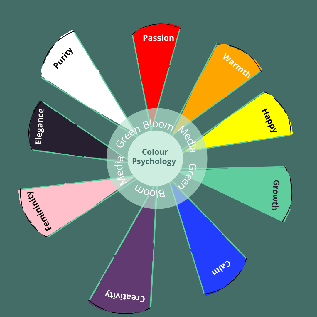
Common associations of colours
Red: Red is often associated with passion, love, and excitement. It can also convey danger, warning, strength, and power.
Blue: Blue is often associated with calmness, trust, and reliability. It can also convey professionalism and innovation, particularly in the tech industry.
Green: Green is often associated with nature, growth, and health. It can also convey wealth and stability.
Yellow: Yellow is often associated with happiness, optimism, and creativity. It can also convey caution or warning.
Orange: Orange is often associated with enthusiasm, energy, and warmth. It can also convey affordability and approachability.
Purple: Purple is often associated with luxury, creativity, and royalty. It can also convey spirituality and mystery.
Black: Black is often associated with sophistication, elegance, and power. It can also convey mourning or sadness.
White: White is often associated with purity, simplicity, and cleanliness. It can also convey peace and tranquillity.
6. Colour Must Be Vertile
Selecting the right colors for your visual identity is crucial, as these colors should be versatile and work seamlessly across all platforms. Utilizing colors that maintain consistency is essential, as it helps reinforce your brand recognition and conveys your brand's personality and values. By ensuring your chosen colors are effective across all marketing materials, you can establish a strong emotional connection between your brand and your target audience. This, in turn, increases the likelihood that your brand will be top-of-mind when your audience needs your products or services.
This consistency should extend to various elements such as your logo, website, social media presence, packaging, and other visual components. It also communicates professionalism and meticulous attention to detail. When your marketing materials exhibit consistency, they convey the impression that your brand is well-organized and pays great attention to detail.
To maintain this consistency, it's essential to have clear brand guidelines in place. These guidelines should specify how and where your brand colors are to be used. They may include details on color values, acceptable variations, and specific applications of colors.
When incorporating your brand colors, it's also vital to consider how they interact with other design elements, such as typography and imagery. This thoughtful approach creates a cohesive and harmonious visual identity that uniquely represents your brand.
Brand Asset Colour Design
Color palettes
Choose a colour palette that works well together and aligns with your brand’s identity. You can create a colour palette by selecting one or two main colours and adding accent colours that complement them. A well-designed colour palette can help create a cohesive and unified visual identity.
Typography
Choose typography that complements your brand colours and aligns with your brand personality and values. Fonts can convey different emotions and associations, so selecting fonts that reinforce your brand message is important.
Imagery
Use imagery that aligns with your brand's identity. Imagery can help reinforce your brand's message and create an emotional connection with your target audience. When using imagery, consider the colour palette of the images and how they work with your brand colours.
Contrast
Use contrast to create visual interest and hierarchy in your design. Contrast can be made with colour, typography, or imagery and can help draw attention to key elements of your design.
Accessibility
Ensure your brand colours are accessible to all users, including those with colour vision deficiencies. Use online tools to test the contrast and readability of your design, and consider using alternative text or patterns to ensure everyone can access your brand message.
Choosing the right colours for your brand is a powerful way to connect with your target audience and communicate your brand's personality and values. By understanding the basics of colour psychology you can make informed and impactful colour choices. Remember to use your brand colours consistently across all your marketing materials to build brand recognition and reinforce your brand.
